
How to Display a Bourbon Collection Without Looking Like a Liquor Store
Share
Here's the short version: a bourbon collection stops looking like a liquor store the moment you stop treating every bottle as equally important. Retail shelving exists to move volume, so it packs bottles shoulder to shoulder under flat fluorescent light with zero hierarchy. Your home bar has the opposite job. It only needs to hold your favorites, and it gets to use light, height, and a little empty space to make them look like they matter. That distinction, hierarchy over inventory, is the whole game.
The Liquor Store Problem
Walk into most home bars with an out-of-control bottle count and you'll spot the same three mistakes. Every bottle sits at the same height, on the same shelf depth, with labels all facing the same direction like a planogram. There's no negative space, so your eye has nowhere to land first. And the lighting is either a single overhead bulb or nothing at all, which flattens every bottle into the same beige blur.
None of this is really about how many bottles you own. A collector with 40 bottles can display beautifully if they're organized with intention. Someone with 12 bottles can still make a shelf look like a warehouse clearance if they're just lined up by whatever order they were bought.
Start With Your Best Ten
Before you touch a shelf, pull your ten best bottles: the ones with the most interesting labels, the tallest or most unusual shapes, the ones you'd actually want a guest to ask about. Everything else, your workhorse pours and the stuff you buy by the case, goes into a cabinet or a lower shelf out of the main sightline. This isn't about hiding anything. It's about giving your display a front row.
Collectors resist this step more than any other, because it feels like demoting bottles they're proud of. But a wall of 40 equally-weighted bottles reads as clutter no matter how good the whiskey inside is. Ten well-lit, well-spaced bottles read as curated. Save the deep cuts for when someone asks what else you've got.
Height, Light, and the Rule of Odd Numbers
Group bottles in clusters of three or five rather than one long row. Odd numbers photograph and display better because the eye can't split them evenly, so it lingers instead of scanning past. Within each cluster, vary the height: put a tall bottle at the back, a squat one up front, and let a label or two turn slightly off-axis instead of facing dead-on like a store shelf.
Light matters more than people budget for. A single warm LED strip tucked under a shelf lip does more for a bourbon display than any amount of bottle rearranging. Warm white, not cool white, cool light makes amber whiskey look sickly and thin, while warm light makes it glow. If you only upgrade one thing on this list, make it the lighting.
The Backdrop Does Half the Work
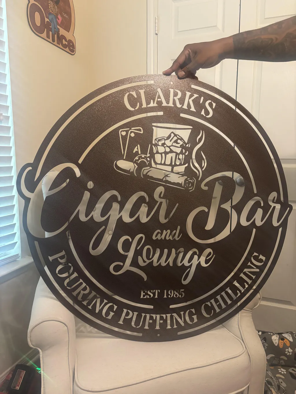
A great bottle arrangement still falls flat against a blank wall. This is where most home bars leave easy points on the table: they spend real money on the bottles and the shelving, then stop, leaving the wall behind it doing nothing. A single strong piece of wall art, something with texture and shape rather than another flat framed print, gives the whole setup a focal point and pulls the eye up and away from the bottle count, which is exactly what a collection under construction needs.
A laser-cut steel piece works especially well here because it holds its edge and finish for years without fading, warping, or picking up that yellow bar-light tint a poster gets after a couple of seasons. Something like a Bourbon Whiskey Rocks Glass wall art piece sits above the shelf and gives the whole wall a clear subject before anyone's eyes even get to the bottles. If you want more options, the man cave sign collection has pieces built specifically for the space above a home bar.
Rotation Keeps It Alive
Static displays go stale fast, even good ones. Every couple of months, swap which bottles sit in the front-row ten. Bring a recent finish forward, rotate a favorite back to the cabinet, and let a seasonal pour take center stage in fall and winter. This does two things: it keeps the display from becoming visual wallpaper you stop noticing, and it forces you to actually taste through your own collection instead of just accumulating it.
Rotation also solves the "which bottle do I open tonight" problem. If a bottle's been sitting in the front row for two months, that's your answer.
The Verdict
A bourbon collection reads as curated when it follows three rules: fewer bottles up front than you think, warm light instead of none, and a real focal point on the wall instead of a blank one. Skip any of the three and you're back to looking like inventory. Nail all three and even a modest ten-bottle shelf will outshine someone else's overstuffed hundred.
Start with the wall. It's the cheapest fix with the biggest visual payoff, and it's the one thing that makes every bottle in front of it look more deliberate than it did an hour ago.